We see them every time we fire up a game, but do we really appreciate them? We take a look at some of the best game logos of all time.
Video games are more popular than ever, with an estimated 164 million adults in the United States alone playing games regularly.
With the popularity of games continuing to increase, we thought it’d be fun to take a look at an often overlooked feature of our favorite games: their logos! A logo has the important job of setting the tone with little more than text and color. If you like to make your own game logo or any kind of logos take a visit at this page.
And while there are plenty of great game logos out there, some stand above the rest. Here are our picks for the five best game logos of all time.
1. Super Mario

Nintendo’s flagship franchise is practically synonymous with video games, generating billions of sales worldwide. Of course, anyone who has played a Mario game can understand why, as the series captures a sense of fun and whimsy like no other franchise can.
In this instance, we’re talking specifically about the Super Mario logo, with its multi-color logo and rigid lettering. It’s only fitting that Nintendo gave their favorite plumber such a fun, family-friendly logo!
2. Mortal Kombat

In terms of both gameplay and its logo, the Mortal Kombat franchise is about as far from Super Mario as you can get. Still, the iconic dragon with rage in its eyes deserves a place in the game logo hall of fame.
Throughout the years, the franchise has kept the dragon motif even during generational and canonical shifts, which seems fitting given the series’ penchant for brutality and sleek design.
3. Pokémon
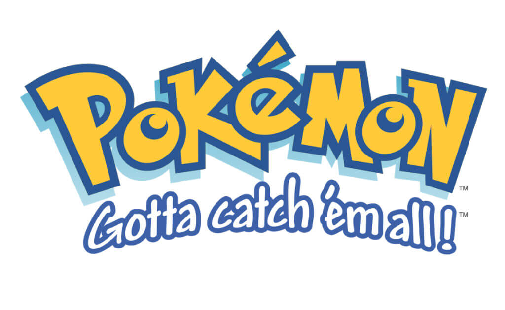
If you were alive in the 1990’s, you’re no doubt familiar with the blue and yellow bubble lettering of the Pokémon logo. It’s colorful, inviting, and hasn’t changed much in the franchise’s 20+ year history.
Plus, it was a brilliant move matching the logo’s bold yellow font with the series’ iconic mascot, Pikachu. Kudos to you, Game Freak!
4. Pac-Man

In the world of marketing, simple designs tend to do best if creatively and graphically illustrated. And it’s hard to get much simpler than a logo inspired by a pizza with a missing piece.
However, there’s more to the Pac-Man logo than meets the eye. For instance, the ‘C’ is represented by Pac-Man himself and the hyphen resembles the game’s signature dots that Pac-Man has to eat to gain points.
It’s such a popular logo that Adobe includes ghost icons in its free-to-use game logo software.
5. Half-Life
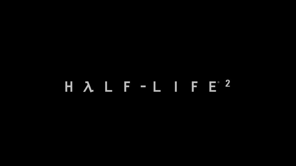
Clean white text, thoughtfully spaced letters, and the clever inclusion of a lambda. That’s all it took to create the logo for one of gaming’s most popular shooters.
Yet there’s something so cool about the logo. It’s simple, sure, but it’s also clean, much like the Black Mesa labs at the beginning of the game. It’s a fittingly sophisticated logo for a game that breathed life into a genre on its dying breaths.
What Do You Think of Our Picks for Best Game Logos?
So, what do you think? Did your favorite logo make our list of the best game logos?
Undoubtedly, there are plenty of great options that we missed, so let us know! And don’t forget to check back with BagoGames for more great content about your favorite games.
This article contains sponsored links.


